Amid the Covid-19, selling online benefits us more than ever because it erases distant barriers, allowing sellers and buyers to trade at their comfort. However, on the merchants’ side, things are not so bright with “cart abandonment”. In this article, we’d introduce you to the roots of this painful phenomenon and recommend 4 brilliant tips to reduce cart abandonment for your Shopify store.
Table of Contents
What is Cart Abandonment and How to Calculate it?
Cart abandonment happens when a customer adds a product to cart without proceeding to checkout. In another word, that item, though makes its way to the cart, stays untouched and cannot bring you any profit.
Here is the formula to calculate the cart abandonment rate for your Shopify store. Simply divide the number of successful purchases by the total number of carts triggered. Next, subtract this value to 1 and multiply it by 100 and you’re done.
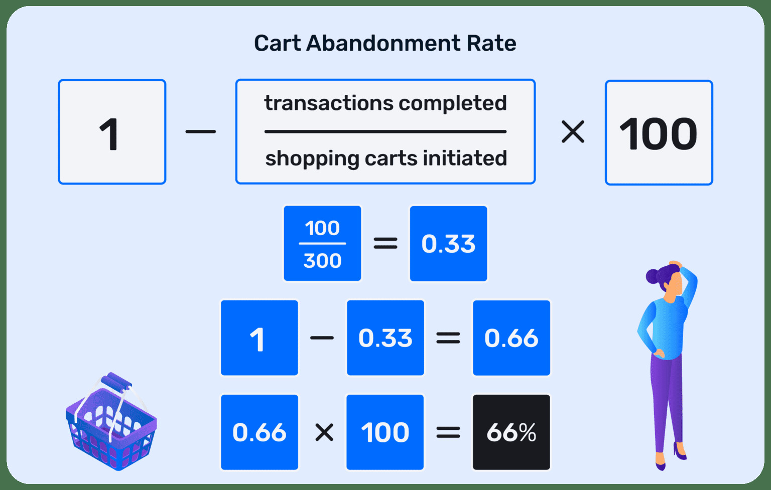
The simple formula to calculate cart abandonment rate
To calculate this rate for your Shopify store, in the admin dashboard > Analytics > Dashboards. Afterward, navigate to the “Online store conversion” section to view your performance. The “added to cart” shows the total number of carts initiated while the “sessions converted” indicates the number of transactions completed.
However, we do not recommend you to grab a pen and some paper to do maths. Instead, click here to know how to track the cart abandonment rate of your Shopify website with Google Analytics!
How to tell if you have a high cart abandonment rate or not?
According to the stats brought to you by Optinmonster, cart abandonment varies significantly by industry and product. That’s why it would be arbitrary to conclude you have a low or high cart abandonment rate without comparing it with the average rate in your niche.
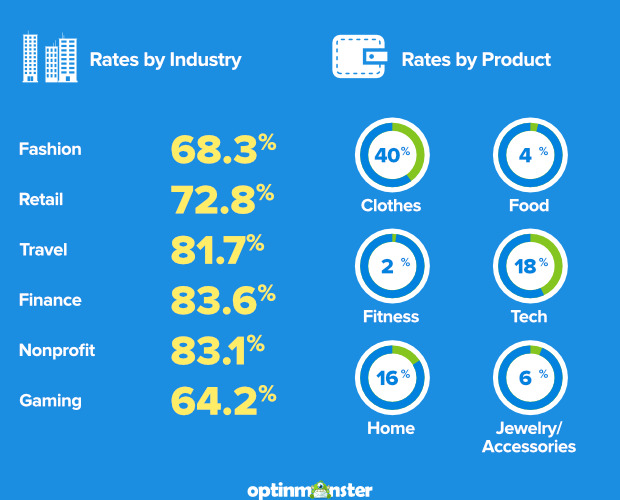
Stats and image credit: optinmonster
If your store’s cart abandonment is above the average, apparently there’s much room for improvement! But to reduce cart abandonment for your Shopify store, you must understand its roots first.
Why do your customers abandon their shopping carts?
Have you ever seen someone adding miscellaneous items to their cart at Walmart and then leaving instead of processing payment? I bet this scene is a rare sight, isn’t it?
That’s because patrons don’t have any reason to abandon their carts at brick-and-mortar stores. Their shopping journey begins upon their arrival at the stores, next, they pick the items they want and walk to the cashier to finish their purchases. Period!
See? Offline shopping allows customers to have complete control over their spending and security issues regarding payment, etc., which they can hardly ever afford with online shopping.
Ladies and gentlemen, that’s why digital shopping cart abandonment happens regularly. Check out the graph below for more in-depth insights!
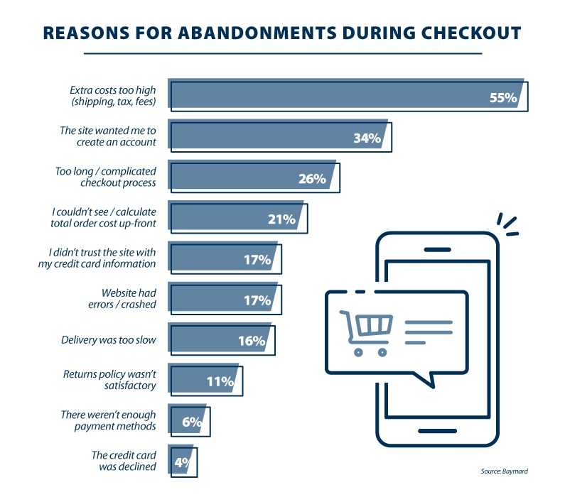
Here are the most common reasons why customers choose to give up on their carts
Basically, the reasons above can be grouped into 4 cluttered reasons why customers give up on their shopping carts while browsing your website.
- Unexpectedly high shipping costs and fees
- Complicated checkout process
- Website UX-UI
- Trust issues over security
After you have a better grasp of the causes of the problems, it’s time we serve you the main course- our 4 best tips to help you reduce your Shopify cart abandonment.
How to Reduce cart abandonment for your Shopify store?
No matter how splendid your product or service is, cart abandonment will always persist. Plenty of Shopify merchants, in fact, have lost huge sales because they cannot keep this rate at bay.
Now that you know why your website visitors abandon their shopping carts instead of completing purchases, it’s time to tackle the issue from its roots.
Simplify the checkout process
eCommerce shoppers are now much more impatient because they can turn to hundreds of alternatives within a few clicks. Once they feel like you’re wasting their time, you’re losing a potential customer to your competitors.
Do you know 4 out of 10 online shoppers abandon their carts when required to fill up lengthy registration forms, create an account or login before check out?
We know there is so much necessary info you need to collect before selling your products. However, more importantly, you must design the checkout process as direct as possible.
Make it short and clear
According to a survey carried out by Smashing Magazine on the 100 best eCommerce websites in terms of sales, the average checkout process consists of 5.08 steps.
Although most companies have a 5-step checkout process, some can have more steps and still enjoy a good conversion rate. However, if you don’t have loyal customers yet, we suggest keeping the entire process under 4-5 stages.

Include a progress indicator for your checkout page to be clearer
Ideally, your checkout page should include the following pieces of information:
- Checkout
- Delivery details
- Payment details
- Review and confirmation
Check out as guest
We know you need to collect customers’ emails to keep them update so that they will return for their next purchases.
However, make sure “creating an account” is optional and they can check out right away without having to do so. Well, I mean you can incentivize your customers to sign up for a new account, perhaps a line “Sign up easily, earn rewards instantly” like Paula’s Choice does might help.
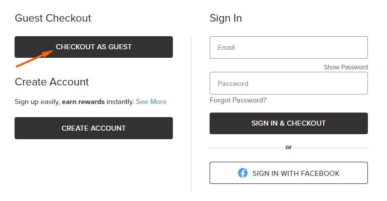
Give your customers various options, including “Guest Checkout”
Believe us! If they are satisfied with your products and feel like you deserve their time, they’ll soon create an account.
But if it’s their first time buying, show them mercy by cutting down on the steps they have to go through before they can complete their orders.
Strive for greater transparency in shipping costs
Online shoppers are highly sensitive to shipping costs. If you can’t find the right shipping partners to help them save some more money then at least, be clear.
Be upfront about shipping costs
Do not jump-scare your customers with unexpected shipping costs at the end of their transactions. Instead, be crystal clear about how much will it cost to deliver your products to them.
Estimated Delivery Time
Another thing about shipping costs we think you should pay more attention to is the estimated delivery time. Well, most of the visitors who add your products to carts are those with the highest buying intention, it’s understandable that they want to know when they will receive it.
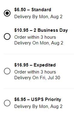
Available shipping options at Sephora.com with crystal clear delivery times
Take a look at Sephora shipping options on the website. For each package, the brand shows a specific delivery time. A little more transparency is a recipe for a significantly better customers experience.
Free shipping
Since online consumers are now highly sensitive to shipping costs, once you eliminate this cost for them, you also eliminate the biggest reason for them to abandon their cart.

On the product info page, put a small notification to incentivize them to buy more
Though you don’t need to apply free shipping on any of the customers’ orders unless you want to file for bankruptcy. What I mean is that you can put a threshold to incentivize your customers to reach if they want to enjoy free shipping.
Add a Chatbot to your Shopify store
Do you know that 41% of online shoppers expect live chat on your website and this number goes up to 50% if they visit your website on a mobile device?
So if you don’t offer live chat on your Shopify website, you’re literally ignoring your customers. You might think we are being too dramatic, it’s not big of a deal! Well, but indeed, it is!
Therefore, add a live chat on your website to assist your customers to check out or else, they’ll turn away and abandon their carts. And the app we want to introduce for this functionality is Socialreply.
With Socialreply, you can add a live chat on your website to let customers know they can reach you when any errors arise. You can address their problems, give them consultant service, or promotion codes to incentivize them to finish the cart.
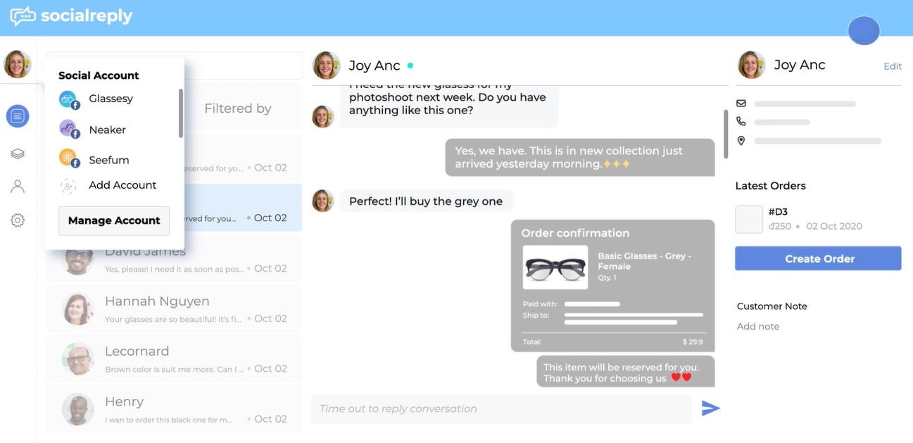
Sending out your shopping assistant to assist customers throughout the whole process
Moreover, you can expand your customer list by converting customers to subscribers, the only thing they have to do is approve a checkbox.
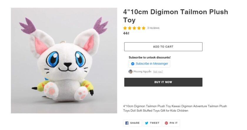
Socialreply offers subscribe checkbox which helps customers instantly leave questions about the products and recover the shopping cart abandonment
A lot of messenger chat plugins offer this function, but with Socialreply, you can add the subscriber checkbox at your product page, shipping page, or literally anywhere you think your customer needs more information. Check out Socialreply here for your reference.
Build trust from your transaction forms
Online scams have recently become so prevalent that many people do have trust issues when they shop something online. Therefore, you need to prove that customers’ confidential information is safe and sound when they process the payment on your website.
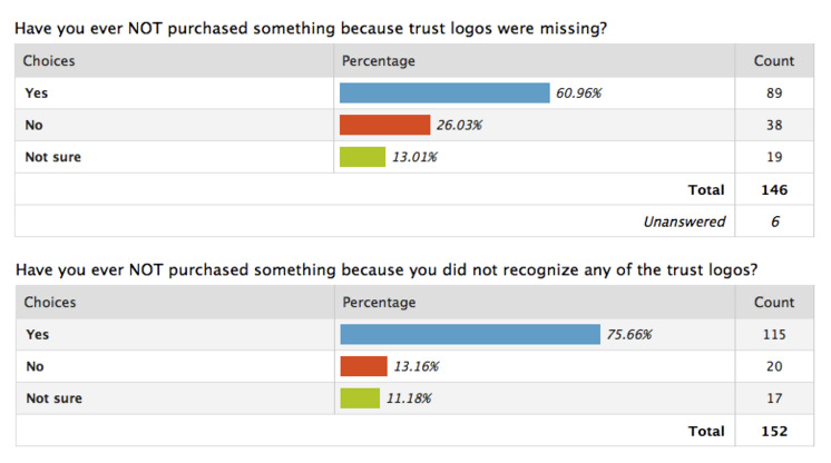
And there is no better way to gain their trust than a verified logo. The stats below speak for themselves!
Stats and image credit: Shopify
Asking your customers to fill up your transaction forms with their credit card details literally means asking them to trust you wholeheartedly, which many people won’t do unconditionally.
- 61% of customers abandoned their carts because trust logos were missing
- 75% of customers opted out because they didn’t recognize the trust logos
That’s why as an eCommerce store, you must make sure your security logos are popular among the people whom you target. Here are the most common ones that US online shoppers trust the most:
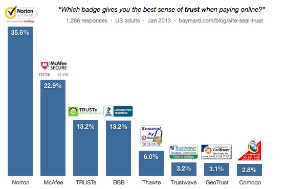
It turned out US online shoppers trust Norton the most, followed by McAfee
Here comes a practice from Paula’s Choice. Besides accepting multiple payment methods, the brand also makes online shoppers rest assured with a security signal on the checkout page.

Put the trust signal logo somewhere that your customers can easily notice
During the whole checkout process, the brand always guarantees that the McAfee logo is positioned in a way that attracts attention right away.
Final words
Cart abandonment is a pain for every merchant and those who cannot keep this rate at bay will have to deal with poor sales performance. Therefore, we hope our tips above can help you to reduce the cart abandonment rate for your Shopify store.
 socialhead

